Color and visual impact
A painter only needs to look at the palette in his hand before painting, and the photographer's palette is the entire shooting scene. It is not easy to find the right color that can serve your work from such a palette. Today we'll talk about how to use your palette to capture the audience's eye.
When you pay attention to shadows, highlights, depth of field, shutter speed and other technical details, It will be easy to ignore the key factor of color in shooting. The famous Russian painter Vasily Kandinsky once said: Color is a force that strikes the soul. So learning how to use color flexibly in your photography can not only firmly grasp the eyes of the audience, but even affect their emotions.
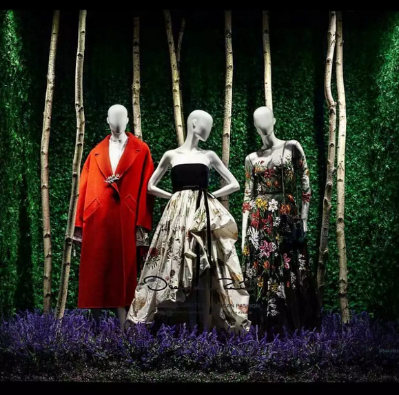
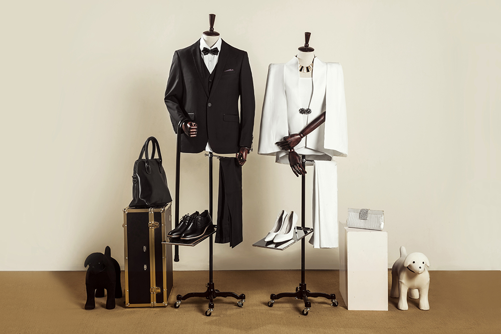
In order to maximize the color of the subject, first you must learn to find the right background. For example, the color of the main character of the picture itself is more conspicuous, you can choose to combine the soft and even slightly dim background color with your center color. This sharp contrast will greatly attract the attention of the audience. Because if you choose a background color similar to the subject's color, the viewer's eye will be drifted away from the background and theme, and they can't immediately understand what is the center of your picture.

If you want to attract the attention of the audience, please try to reduce the hue in your picture. Because the complex and diverse colors will make the audience dazzle, weaken the theme of the picture. On the contrary, simplify the color of the picture and make the color of the picture uniform, which not only makes the audience feel comfortable, but also makes the work harmonious and orderly.